Discussion Point: National Geographic
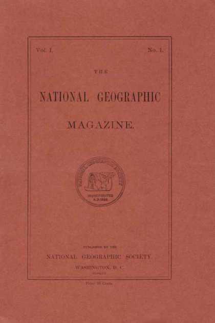 |
| Issue #1, 1888 |
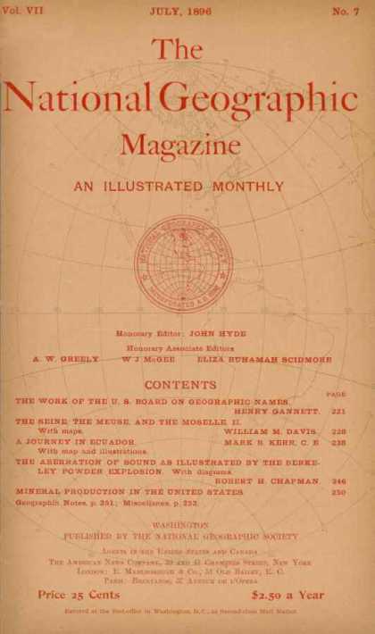 |
| Issue #46, 1896 |
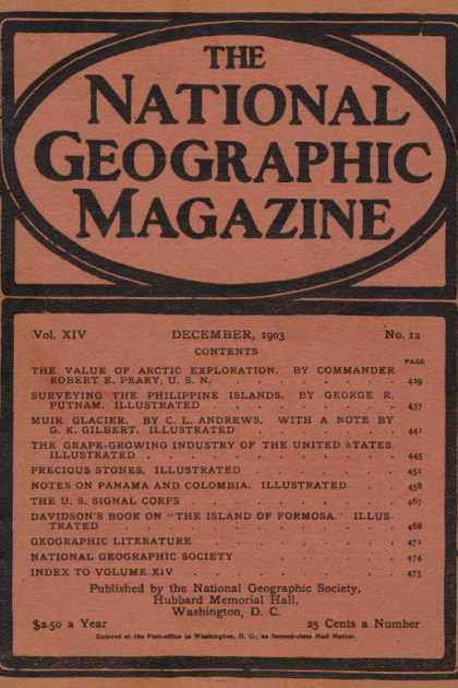 |
| Issue #135, 1903 |
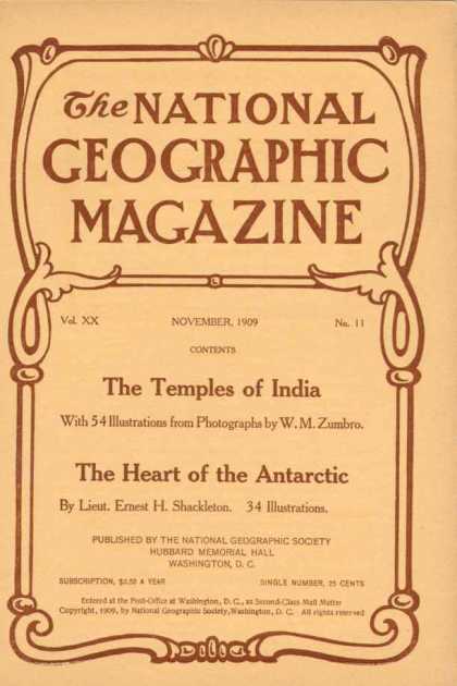 |
| Issue #206, 1909 |
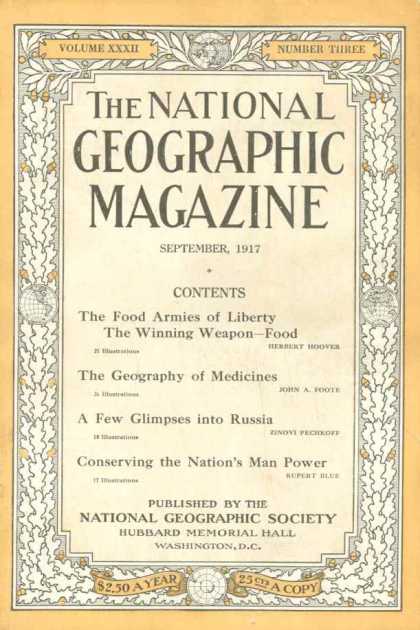 |
| Issue #300, 1917 |
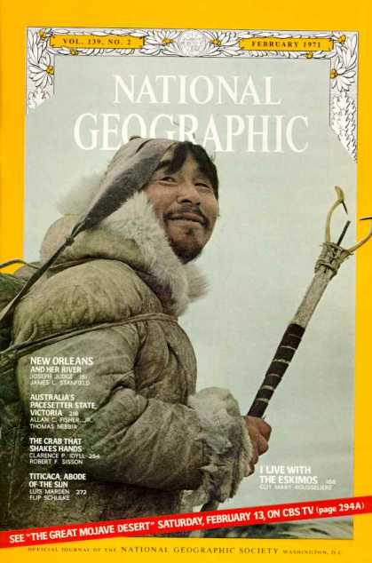 |
| Vol 139 No.2, 1971 |
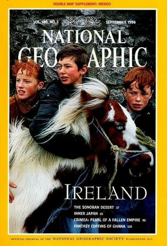 |
| Vol 186 No.3, 1994 |
 |
| In a publishing first for National Geographic magazine, each copy of the January 2013 issue will feature five covers highlighting the Society’s 125thanniversary theme, “A New Age of Exploration.” |
-------------
Qn: How has use of visual hierarchy and grid evolved with the emergence of digital technologies over the traditions qualities and potential constraints inherent in letterpress? Find 2 examples to compare and contrast.
I will compare and contrast the first issue of National Geographic and the 5 cover specials of the January 2013 issues.
The use of visual hierarchy has evolved in that more and more options are have emerged along with advancement in technology. The magazine title remains at the top of the hierarchy, followed by the image and content, and finally miscellaneous information such as issue number / pricing. This order of hierarchy has remained fairly consistent throughout the magazine's lifetime, with the exception of the emergence of the feature article/theme highlight.
With letterpress technology, variations in hierarchy was limited to colour and available typeface. (Admittedly it was also very traditional in style and not the most adventurous example of what could and was done with letterpress, but this was 1888 and the society would have had to keep it's target audience in mind.) The 2013 issues clearly display much more variation in the choice of typeface weights, colours and transparencies - arguably also a reflection of the democratisation of National Geographic's readership.
The use of grid has similarly evolved along with technology; the 2013 issues display much more flexibility, along with a departure from a strictly symmetrical, centred layout. Again this reflects the broadening of the magazine's target readership. We can also observe the advancement in printing technology through the interweaving of image and title in the 2013 issues.
Finally, with globalisation and expansion, (and to show graphic design outside the Western cultural sphere), we can also observe further evolution via local language editions of National Geographic and sub-magazines (e.g. Kids editions). We can see how the English version of the magazine title defers to the local language title in the Arabic and Chinese editions. Interestingly this is reversed in the Romanian edition, with the local version of the magazine title deferring to the English title.
 |
 |

References
http://www.coverbrowser.com/covers/national-geographic
http://izismile.com/2012/06/14/national_geographic_covers_over_the_years_20_pics.html
http://press.nationalgeographic.com/2012/12/12/magazine-january-2013-exploration-5/
http://press.nationalgeographic.com/2012/11/20/ng-launches-local-language-edition-in-iran/
http://press.nationalgeographic.com/2013/03/25/sanoma-media-ukraine-to-launch-ngm-in-april/
http://press.nationalgeographic.com/2013/01/11/qingdao-publishing-group-to-launch-national-geographic-kids-in-china/
No comments:
Post a Comment