Jan Tschichold and Anna Garforth have made many distinguishing contributions to typography both pre and post digital. They have both worked in innovative ways to create their typefaces, looking at type in new and exciting ways. Jan Tschichold has shaped the way in which we view and use type in design, advocating clean, simple lines that were uncluttered and stylish in their simplicity. Tschichold brought about a steadiness to the world of typographic design in a time when irregularity and disproportion were the main tools of the designer. He moved type design out of the heavy set, thick black type of the gothic styles that came before him. He created firm boundaries, straight lines and rigid compositions.

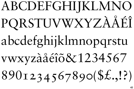
Tschichold simplified typography designs
and layouts, creating many different fonts, including Sabon and Transit.
Sabon Typeface
This simplification can be easily seen
through Tschichold’s Penguin Book covers. Pre Tschichold, Penguin Books used
two different fonts, along with a mix of bold and normal weights. Tschichold
simplified the covers down to one font and weight, and focused wholeheartedly
on the tracking and kerning of the individual letters, spacing out each one to
give a more refined and cared for design.

Tschichold's Cover on Right
Tschichold was a typographic designer
creating before his time; he was supremely influential in showcasing how type
can be more than simply type. It can be an art form and design in itself. He
taught others to take care in the positioning of their type on a page, as well
as the simplification of the actual typeface.
Another designer who is innovative in the
field of type and type design is Anna Garforth. She creates tactile typefaces
in response to the world around her. She creates typefaces using many different
mediums, including dough. Garforth’s ‘Edible Poster’ is an experimentation into
linking type with new forms of creation, that of edible work. Garforth has also
experimented with other forms of creating type. She creates type by growing
moss in the form of the letters in her work for Saatchi and Saatchi as well as
her own work ‘Grow’. Garforth highlights that type does not simply have to be
2D. As digitalized design becomes more commonplace, designers are branching out
and further extending themselves by pushing the boundaries to create bigger and
bolder designs that are constantly evolving and innovating.


Edible Poster Type

Grow Type

Saatchi and Saatchi
Both Tschichold and Garforth were
innovative before their time, creating a shift within their own design fields.
While they created their typefaces in very different ways, and very different
forms, they were similar in that they were leaders in the typographic design
field. They were also similar through their handling of type as an art form and
not just simply a way to convey information; type is used to convey meaning as
well.
Resources-
Jan Tschichold- www.historygraphicdesign.com- information
- retinart.net- information
- www.olivertomas.com- Penguin Book picture
- identifont.com- Sabon Typeface
- heathershawdesign.com- Page Layout
Anna Garforth- www.annagarforth.co.uk- all pictures and information
No comments:
Post a Comment