Thursday 14 March 2013

Gareth Hague

This typeface designed by Gareth Hague. This typeface first attract me was letter A. It is a reversed A and it gives a heavy feeling of this typeface. I think it suited on some high class things.
In terms of drawing, logos of course exist as themselves only, so the rules of their drawing are narrowed to the extent of – usually – a very few letters. From the letters supplied, there should be enough information to best-guess the rules to complete the font – size/shape of serif, character width, and so on. For the four letters in the Prada logo there are similarities with various ornamental serif fonts from the late 19th – early 20th centuries, but with more inconsistency of drawing than you would expect in a fully drawn typeface – the round inner bowl of the P and R that is straight in the D, the wide difference in thickness of line. When making an alphabet maintaining these differences of drawing, this produces inconsistent but not necessarily unworkable letter shapes. Removing these inconsistencies would make the typeface a different idea to the logo. It would normalize the typeface, removes what makes it special and surprising. Normalizing also means giving an extra usability, making the Prada typeface in this work in progress version upper case only and most suitable for headline, impact use.
Other typeface was designed by Gareth Hague.


I like these heavy feeling, bold type. One typeface can show application’s personality.
 
 
References:

Monotype Corsiva


Monotype Corsiva

Monotype Corsiva was designed in 1995 by Patricia Saunders who was asked by Monotype Corporation to design a typeface for formal occasions after her successful work on the Arial font.

The font is a sloped, serif design, featuring swash capitals and attractive rendering for formal use (Fonts.com, 2013). It is known to be a very charming and elegant typeface making it an appropriate choice for settings such as event invitations, and formal certificates to add sparkle and give a sense of occasion. One of its best qualities is the cursive which achieves a fancy finish without making texts indecipherable.
Inspired by the swash design with characteristic flourishes, Monotype Corsiva was initially designed to be capital letters justifiably as using the font entirely in uppercase can look very heavy whilst its lowercase form is much easier for the reader to digest. For this reason, it is most popularly used in advertising only for logo design and very short advertising texts.  


Another distinguishing feature of Monotype Corsiva is that it is one of the only commonly available fonts which 
contains the Te (a Cyrillic T with three legs) when seen in its Cyrillic form.

Monotype Corsiva is based on a Chancery cursive typeface, an italic type typeface inspired by the style of the early Italian cursives during the renaissance period in the sixteenth century. This letterform comes from the early masters of print who were very well educated in the fine art of calligraphy and illuminated manuscript. ‘Corsiva’ as a letterform was influenced by the work of Ludovico Vicentino degli Arrighi a scribe popular during the renaissance period in Italy whose contribution to typography is prominent in the rendering of chancery.


Monotype Corsiva was created by the typesetting machines by Monotype Corporation using hot metal to cast individual letters. Thus it is part of the Monotype design foundry. Monotype Corporation also produced a large library of typefaces most of which are familiar today including Arial, Bookman old style and Century gothic. (IDENTIFONT, 2009)
Monotype Corsiva is now a commonly used font for both designers and word software user, incorporated into soft wares such as Microsoft office Suite (Microsoft, 2013).  

Fonts.com, 2013. Monotype Corisva. [Online] 

Available at: http://www.fonts.com/font/monotype-imaging/monotype-corsiva#product_top
[Accessed 13 March 2013].

IDENTIFONT, 2009. Monotype. [Online] 

Available at: http://www.identifont.com/show?LZB+2
[Accessed 13 March 2013].

Microsoft, 2013. Microsoft Typography. [Online] 

Available at: http://www.microsoft.com/typography/fonts/family.aspx?FID=33
[Accessed 13 March 2013].


AVENIR


It’s interesting to note just how effective such simple details like typefaces make to an organisation at large. There is a sense of unity, refinement and definition in identity that is demonstrated to its audience and which has made it fascinating to research.

The geometric sans-serif typeface Avenir was released by the foundry of Linotype GmbH, which was the United States’ leading manufacturer in books and newspaper equipment. Designed by Adrian Frutiger in 1988, the font Avenir has in recent years made a few notable appearances throughout the world one way or another.

Certain Type

The designer, Adrian Frutiger was born in 1928 in Unterseen, Switzerland. His career began when he was initially recruited by the Parisian foundry Deberny et Peignot - he was recognised for his accuracy in skill, quality of work, meticulousness and knowledge of letterforms presented in his wood-engraved illustrations (Sadha, 2012). Today, he is recognised as a typeface designer who was able to successfully influence the direction of digital typography during the late 20th Century. 


HFour
The typeface Avenir which means ‘future’ in French was initially inspired by the works of Jakob Erbar’s Erbar (1922) and Paul Renner’s Futura (1927) however with a spin (Ward, 2010). Frutiger intended to create Avenir in a way that appeared to be more organic in movement; with that being said Avenir is not a truly geometric sans serif typeface but a blend of geometric and humanist san-serif conventions. Humanist san-serif typefaces would be considered as those fonts which have slight imperfections in terms of line width; which differs to geometric sans-serif which pride themselves on near perfect circles and squares as well as being even in lines. 

"Obviously this could not be an outstanding new creation, but I have tried to make use o fthe experience and stylistic developments of the 20th century in order to work out an indepent alphabet meeting modern typographical needs" - Frutiger (Linotype)


It was through the late 1990s that Fruitger began to collaborate with the in-house designer at Linotype GmbH Akira Kobayashi. Together the pair worked on refining and expanding Frutigers’ typefaces which included Frutiger, Univers and Avenir. They were able to remodel a font family which could adhere to onscreen display requirements, as well as introduce an extended font family: Avenir Next (Homburg, 2004). This meant that there were now four typeface sets within the group: Regular, Italic, Condensed and Condensed Italic as well as six new weights: ultralight, regular, medium, demi, bold and heavy. Fascinatingly enough, the vertical strokes are much thicker than the horizontal (Ward, 2010) By creating such a vast selection of fonts, Avenir became flexible and has meant that it can suit any purpose and can be implemented within works easily.

Hotel Amsterdam

BBC Two 

Gizmodo

Today, Avenir is seen throughout our advancing world; in ways we have not known before! The Avenir typeface for instance is dubbed as the city of Amsterdam’s principle typeface in establishing its corporate identity. The UK broadcasting channel BBC Two has also recently adapted the use of Avenir within its corporate logo. Even airlines have hopped on board and begun to use Avenir as seen on Hong Kong International Airport as well as Japanese Airlines. And, to make things seem a little closer to home or perhaps, too close - switch to your iPhone and check out Maps, Apple have adapted the use of Avenir in its latest Mountain Lion system as well as all iOS 6 interfaces! (Diaz, 2012)


Reference List

  • Diaz, J. (2012) "This is Apple's New Favourite Typeface (Updated)" <http://gizmodo.com/5930274/this-is-apples-new-favorite-typeface> accessed 13th of March 2013
  • Gianotten, H (2003) "Avenir, The Future for Amsterdam" in Linotype News Press Releases <http://www.linotype.com/en/2849/avenirthefutureforamsterdam.html> accessed 14th of March 2013
  • Homburg, B (2004) "Linotype presents Avenir Next" in Linotype News Press Release <http://www.linotype.com/en/2839/28_04_2004.html> accessed 14th of March 2013
  • Hotel Amsterdam (2013) "Hotel Amsterdam Photo Gallery" <http://www.hotelamsterdam.nl/pics-en.html> accessed 14th of March 2013
  • Linotype (2012) "Type Gallery - Avenir" <http://www.linotype.com/1116/aboutthefont.html> accessed 13th of March
  • Sadha, A (2012) "Thinking Adrian Frutiger" in Thinking Form <http://www.thinkingform.com/2012/05/24/thinking-adrian-frutiger-05-24-1928/> accessed 13th of March 2013
  • Ward, S (2010) "Avenir Typeface Genealogical Study" <http://hfour.jp/2010/08/avenir-typeface-genealogical-study/> accessed 13th of March 2013

Neutraface


Neutraface - this typeface was designed by Christian Schwartz for House Industries (an American type foundry) in 2002. It is a geometric sans serif typeface. The creation of this typeface was influenced by the characteristics of the architectural design of Richard Neutra. It was also developed with the assistance of Neutra's son and his former partner.

Richard Neutra
Richard Neutra was born in Vienna in 1892 and established his first own practice in Los Angeles in 1926. He was well-known with his residential buildings, while in his commercial projects, he could also resonate the same ecological-unity with the surrounding landscape and uncompromising functionalism. His attentions to the details of his project were not only being shown on the structure and appearances of the buildings, but also shown in the small details such as the signage for his buildings. Neutra specified lettering that open and unobtrusive, the same characteristic of his projects. Therefore, the design of Neutraface contents the same linear geometry with an unmistakably warm and human feel.

The Kaufmann House, designed by Richard Neutra in 1946

The design project of Neutraface was started with a goal of designing "the most typographically complete geometric sans serif family ever" by Christopher Schwartz. With the consultation with Neutra's son and his former partner, and the reference of Neutra's signage designs, the Neutraface alphabet was developed. As there were not many signs of Neutra's that could be referred to, much of the work of Schwartz was to interpret. Since Neutra never used any lowercase alphabet, Schwartz needed to interpret the possible designs and also reference from other typefaces such as Futura, Nobel and Tempo.

Neutraface Medium & Bold
Netraface has been widely used in the society since its development in 2002. Its simpleness and clean charactertistic have attracted many users. It is full of classic character, unique and subtle. It gives us a glimpse of how Neutra's architectural believes should be - linear and simple yet warm. 


The popularity of the use of Netraface can be seen in many places and different occasions. It could be the sign of a famous restaurant (e.g. New York Shake Shack Chain), the typeface of a book title (e.g. Taschen's Movie Icon), an advertisement (an ad of Wendy's fast food restaurant), and even the poster of Hollywood movie (e.g. Quantum of Solace). 
New York's Shake Shack Chain
Taschen's Movie Icons

Advertisement of Wendy's Fast Food Restaurant

poster of Movie- Quantum of Solace

References: 
Holder, M. (2012), available at http://pixelink-studios.com/studio/?p=665
House Industries (2012), available at http://www.houseind.com/fonts/neutraface/neutrahistory
Schwartz, C (2011), available at www.christianschwartz.com
"Sighting" in House Industries (2012), available at http://www.houseind.com/fonts/sightings/


Wednesday 13 March 2013

FUTURA


Futura is a geometric sans serif typeface influenced by the Bauhaus design style of 1919 - 1933. It was developed by Paul Renner from 1924 to 1926 before he commercially released the final design of the typeface the following year. It is based on geometric shapes, each letter is derived from simple geometric shapes including near perfect circles, triangles and squares which helps it achieve its consistency from character to character. Its strokes are of near-even weight which differ marginally, this is most evident in the stroke of the letter 'o' which is an almost perfectly round stroke. The lowercase letters in Futura have really tall ascenders in contrast to many other typefaces where they actually rise above the cap line. When designing Futura, Renner kept things as simple as possible by rejecting any decorative and non essential elements to be added to the characters. The uppercase characters have proportions comparable to classical Roman capitals. It is a typeface that relies on both classical and contemporary type conventions. Its appearance has been described as efficient, forward, clean and elegant.

Considering that Futura was designed so long ago, it has had an enduring life span and has been used widely and consistently through its history. In the 1950s it was commonly used by the publishing industry as a general purpose font. Today it is still an important typeface family and is seen being used for print and digital purposes as both a headline and body font. An interesting fact is that the Futura typeface even made it out of the Earth's atmosphere to the Moon as Nasa decided to use it for the plaque left by Apollo 11 astronauts during their visit to the Moon over 40 years ago. It is also known as Stanley Kubrick's favourite typeface, one which he used in the title sequences and posters of 'Eyes Wide Shut' (1999) and '2001: A Space Odyssey' (1968). Futura is also the typeface responsible for many well known logos such as Domino's Pizza, Absolut Vodka and HP for example. Ikea also used it in their catalogues but discontinued in 2010. Well known artist Barbara Kruger also used the typeface in many of her artworks, for example in her piece 'I shop therefore I am' (1987). Closer to home and a very recent use of the typeface Futura, the Western Sydney Wanderers Football Club formed in 2012 have used it in their logo and club documentation. Despite all these examples of popularity the typeface was not always very popular, in 1933 Futura was banned in Hanover by the Lord Mayor who said it did not conform to Germanic Style.


Futura was not the first geometric sans serif typeface, but it was the most successful and has gone on to inspire many other typefaces such as Kabel, Metro, Vogue, SpartanTwentieth Century, and Century Gothic among others, which have used Futura for their foundations.

Vinko Kraljevic

"Behaviour.apply('webfont_button');." Futura® ND. 12 Mar. 2013 <http://www.myfonts.com/fonts/neufville/futura-nd/>.
"Futura – Past, Present and Futura(e)." Nadinechicken. 12 Mar. 2013 <http://nadinechicken.wordpress.com/2011/12/27/futura-past-present-and-futurae/>.
"Futura | Typophile." Futura | Typophile. 12 Mar. 2013 <http://typophile.com/node/12494>.
Ronson, Jon. "Citizen Kubrick." The Guardian. 26 Mar. 2004. Guardian News and Media. 12 Mar. 2013 <http://www.guardian.co.uk/film/2004/mar/27/features.weekend>.

http://www.guardian.co.uk/artanddesign/gallery/2009/sep/02/ikea-font-futura?picture=352473558&morepage
http://nadinechicken.files.wordpress.com/2011/12/futura.png
http://idsgn.org/images/know-your-type-futura/Apollo11Plaque.jpg
https://blogger.googleusercontent.com/img/b/R29vZ2xl/AVvXsEgLwgHF9_0ftCkEeDj_7_4AQSG5Uqc60gBidNazxKcbeAF6VUodP3FExsHpYBs99rbiTPeOKpviM17JtOTL-qKB-nhLHpQk6-KjO9o1MWqmT25vIaV76Y0zFnlb3lGw5TKeAR67XriUt64/s400/kubrick-opening-title-2001-space-odyssey.jpeg


Tuesday 12 March 2013

Edding 850


Johnston


Johnston

Exactly 150 years ago the intricate and iconic British underground system was established which was accompanied by the birth of an almost equally iconic typeface known as ‘Johnston’. 

Bull, J. A Typeface for the Underground


Commissioned in 1913, the British calligrapher and lettering artist Edward Johnston, was asked to create a typeface with "bold simplicity" that was truly modern yet rooted in tradition (Clark, L). The elegant and bold solution was completed in 1916, and was deemed a combination of classical Roman proportions with Humanist warmth- qualities that are known to be the source of inspiration for Eric Gill, when designing the infamous Gill Sans typeface family (Lucas, G)


Bull, J.


Johnston himself only drew one weight when designing the typeface. He based its weight and proportions on seven diamond-shaped strokes of a pen stacked in a row (Clark, L.). This was subtly imposed in the typeface itself, with the diamond used as the tittle of the "i" and "j".
Lucas, G.


As it was becoming less and less practical to use the old wood and metal type, the typeface was revised upon the commission of the design agency banks and miles in 1979, to prepare for the typesetting systems of the day. The result was a reinterpretation of the proportions as well as the creation of a family with two new weights and italics known as ‘New Johnston’ and still used by the transport system as official branding to this day. 


Clark,

What makes the analysis of this typeface so interesting was its birth as a fully commissioned project with a seemingly singular purpose. The job was requested by the commercial manager of the Underground Group to fortify the company’s corporate identity and as such, had various parameters and objectives that normal typeface design did not necessarily have to comply with. One of the main objectives was that the use of the typeface was to prevent the official railway signage from being mistaken as general advertising (Ashworth, M). This meant that the typeface had the purpose of balancing it’s role as a corporate identity tool, yet make a statement about the modernist vision London held of itself at the time, while carrying "the bold simplicity of the authentic lettering of the finest periods".

In many ways the typeface achieved this. It’s heavy stroke weight and wide, symmetrical counters meant that the typeface was crisp and rounded from a distance. True to the humanist style, it was distinctly rounder than many other typefaces of the gothic style (Bull, J). This recall to roman ideals was an indication of the modernist direction that London began to identify with. It is consistently proportioned with straight stems had a certain sharpness around the angular corners and in particular, the uppercase which stark combination of a stout overall appearance, yet individually, incredibly geometric. 

The continual use of this typeface for its original purpose indicates its success in relation to its intention. What as asked from Edward Johnston was a typeface to identify the British underground system, yet the longevity of it’s relevance can be attributed to his ideals in drawing from the best qualities of various typeface periods- in true modernist tradition. Its unique and iconic identity is a case of one of the most successful typeface commissions and branding identities of the 21st century. 


Ashworth, M


Reference list:

1.     Clark, L. The iconic London Underground typeface turns 100 , http://www.wired.co.uk/news/archive/2013-01/16/london-underground-typeface <accessed 10 March 2013>
2.     Burgoyne, P. London 2012: the look of the Games, http://www.creativereview.co.uk/cr-blog/2012/july/london-2012-the-look-of-the-games, <accessed 10 March 2013>
3.     Lucas, G. P22's Johnston Underground fonts http://www.creativereview.co.uk/cr-blog/2013/march/p22s-johnston-underground-fonts <accessed 11 March 2013>
4.     Ashworth, M. The history of the Johnston typeface http://www.signdesignsociety.co.uk/index.php?option=com_content&view=article&id=199%3Atransforming-exhibition-road&Itemid=9 <accessed 11 March 2013>
5.     Bull, J. A Typeface for the Underground, http://www.londonreconnections.com/2009/a-typeface-for-the-underground/ <accessed 11 March 2013>

SR1 - Motter Festival


Designed in 2000 by the late Othmar Motter (1927-2012), Motter Festival is described on FontFont.com as ' born of the desire to forge an alliance of a universally legible serif face with the rhythm and elegance of a gothic.' The typeface first struck me as being uncommonly good for something that was offered free, but it made sense after learning about the designer for this exercise. Motter was also behind the type for the 1976 rainbow Apple logo and the Reebok typeface (both Motter Tektura). He is also sometimes noted as the first Austrian designer established in the international scene.   

Othmar Mottner (1927-2010) Retrieved from FontFont

Perhaps one might first notice the uncommon legibility of Motter Festival, despite its similarity to traditional blackletter. Elements that contribute to this are the san serif terminals, which reduce bulk. The connection between horizontal and vertical elements are also lighter, easily observed in the upper case 'F' and 'P'. This again reduces bulk and creates a more streamlined form.

Next, it is uncommonly dynamic, yet geometric and legible. The largest contributing factor to this are the upward sweeping leaf shape bowls, as most simply observed in the 'o'. This shape appears in the majority of glyphs, but remains tightly controlled, thus creating a striking tension.

Finally, as the form is such a successful lovechild of legible san-serifs and blackletter, there is a rich treasury of associations that can be made with Motter Festival. This results in a font that takes easily to a wide range of situations. Some of these include
  • Illuminated texts (such as the Lindisfarne Gospels)
  • Comic Books (Batman immediately comes to my mind)
  • Academic conventions (illuminated texts then bring scholarly monks to mind)
  • Bilingual uses (looks well with East Asian Heiti fonts, the equivilant of san-serif. Also refer to first image above.)
If any other associations come to mind, please leave them in the comments, it would be quite fabulous if you do. Motter Festival can be downloaded in three lovely weights (for free!) at Fontshop and FontFont.  


References

http://www.motterfonts.com/

http://luc.devroye.org/24887.html

http://www.identifont.com/show?177

http://www.fontshop.com/fonts/designer/othmar_motter/

http://fontfeed.com/archives/othmar-motter-passes-away-at-age-84/

http://www.behance.net/gallery/Dinos-Old-Chinese-Stuff-Zine/5658823

https://www.fontfont.com/fonts/motter-festival
             Waltograph (Walt Disney Script)

Maslows fundamental hierarchy of juman needs show that for any child to be brought up happy and healthy, 5 things are needed in sequential order:

           - Physiological (food, water, air etc)
           - Safety (Shelter, clothing etc)
           - Love/Belonging (family, social interaction)
           - Esteem (self confidence, personal growth etc)
           - Self-actualization (morality, creativity, reasoning)

However, Marlsow's model does not include the sixth and final element... Disney.


Know as one of the most recognisable logos and companies of the 20th century, Disney, founded in 1928 has been the secondary parent and extra sibling to millions of children growing up, through their countless productions of children's and family animations. Embedded with perhaps cherished memories of your favorite film, so too may be the font of this cultural icon. The hand drawn flourished writing your cue to that 6th and final element that shaped your childhood.


Contrary to popular belief, Waltograph font (originally named Walt Disney Script) was not modeled after the handwriting of Waltz Disney himself. The font was in fact created by designer Justin Callaghan in 2000 based off the signature of Walt Disney. Previous to 2000 the font only existed as the logo of the company featuring in the opening credits of all disney animation films. In 1961 however, Waltz disney himself added in the word "Studios" for a limited number of films due to the changed title of the company. It was not until 2000 though, that all letters were created and the font was commissioned and released as a freeware font to the general public.

                                                                               (Comparison of Original Signature and inspired logo.)

The brush script typeface holds a genrally heavy weight and slope that is retained throughout all letters. 
It arrives in two weights  regular Waltograph 42 in OpenType format; and bold Waltograph UI in True Type format. It's constantly changing line weights within letters are inspired from the felt-based ink texters originally used to color the animations that the company produced in the late 1920's and early 30's. These were used by Walt Disney himself on a daily basis and can be seen in his original signature above.

Interestingly, the typeface uses capital lettering for both upper and lowercase lettering. the only main difference to setting upper and lowercase letters appart in Waltograph is their size, and applicable in some cases the stylization of capitals (for example see "e" above)

Whilst you wouldn't use this font for it's sense of clarity (in fact anything below 20 pp. size can become too difficult to read), it is it's nostalgic reference to the past that makes this font a distinguished and loved symbol of one's childhood and is licensed for private use for anyone. (So you can always have a piece of disney for your next home movies!)


References:

http://brentonrussell.com/2010/12/20/design-your-lifestyle-for-happiness-and-fulfillment/
http://www.closinglogos.com/page/Logo+Variations+-+Walt+Disney+Pictures
http://noordinarydaydesign.blogspot.com.au/2011/07/waltograph-dont-do-it.html
http://www.pcworld.com/article/232217/waltograph.html
http://www.slideshare.net/Bubasparx/walt-disney-logo
http://www.tumblr.com/tagged/handwriting%20analysis?language=tr_TR


SR1: Comic Sans MS


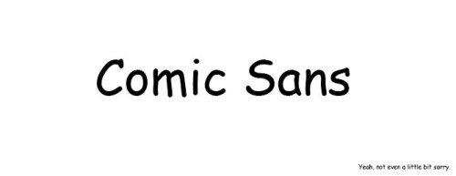
Comic sans is a novelty sans serif script typeface, the modern version of which was designed by Vincent Connare and released as for use in microsoft office in 1994. Connare initially designed the typeface to fill a gap in what microsoft offered as casual font options after seeing Times New Roman being used in speech bubbles of a program being developed to assist new computer users, the typeface was then included in a number of microsoft products and the rest, as they like to say, is history.

Connare drew heavily on the various fonts used in actual comic books (most notably, The Watchmen, lettered by Dave Gibbons and The Dark Night Returns, lettered by John Costanza) at the time to get a similarly informal typeface. This was achieved by him manually drawing each glyph straight into his computer using his mouse, a method that arguably worked against him in creating a fluid and stylistically cohesive font.

One thing particularly lacking, given the typeface’s name, is the ability to effectively use the font in the uppercase which is often the style choice used in comics. It becomes incredibly obvious that the typeface has unresolved kerning issues when it is used entirely in this way (note the space between the T and the A in tangled).


The visual weight of the typeface when used as a body text can also be jarring to read. This is in part due to previously mentioned poor kerning, a fault in the typeface that originates in the lack of letter fit between the characters. In creating a typeface which the characters do not proportionately fit together, proper kerning becomes at best difficult. On top of which, Comic Sans uses unmodulated strokes which can translate as clunky and unrefined when mismanaged. The most blatant example of this is in the lower case ‘e’, in which there is a small eye and large aperture, thanks mostly to the slanted hand drawn effect of the entire typeface. When coupled with the unmodulated strokes it creates a large amount of blac for a small amount of space, throwing off the visual weight of the font.


Comic Sans

Though Comic Sans is hardly a ‘designers’ font there are many compelling arguments for and against its readability. Interestingly, it is often viewed as incredibly readable to those with learning difficulties such as dyslexia. The British Dyslexia association lists Comic Sans as a suggested font for children with such difficulties due to the easily distinguishable characters. On top of which, when the typeface is aliased correctly it can be used successfully at much smaller sizes on screen than a lot of it’s designed-for-print competitors.

Comic sans has literally been used for just about every application a font can be used for, which is part of the public’s general disdain for the typeface. However, it is important to note that the designer himself says

Comic Sans was NOT designed as a typeface but as a solution to a problem with the often overlooked part of a computer program's interface, the typeface used to communicate the message.”.

He reiterates that Comic Sans was intended to be used for children and as an informal, friendly script font it achieves this goal and has been used appropriately for such things as birthday invites, children's books, games and mores specifically was the type used for EA game ‘The Sims’ (and all it’s expansion packs).


Reference List: