How has use of visual hierarchy and grid evolved with the emergence of digital technologies over the traditions qualities and potential constraints inherent in letterpress? Find to examples to compare and contrast.
Visual hierarchy and grid systems have evolved over time, first the use of letterpress technologies to create layouts for magazines compared to more recently the use of computer softwares to formulate online grids, which enabled a wider selection of type and layout.
Visual hierarchy in essence is an organisational tool used to structure information and to provide a template that is coherent to the message trying to be conveyed in the magazine. It helps to emphasise certain aspects of a publication - focusing on flow and legibility with size, style and layout of type and images.
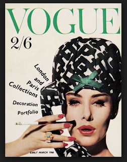
Older versions of visual hierarchy took less risks, and were more simplistic to the eye, with less layers and detail. There was often a set grid that the publication followed with producing the magazine, and the room for variation was far less open as the tools didn't satisfy change. The first image below for example uses one image, one major type, compared to the second, employing variations in type size/thickness and colour.
Similarly, the colour palette was strict - chosen to represent the publication weekly, monthly. The first image uses a green colour scheme - with green also featuring in the models outfit, creating cohesion, similarly in that sense cohesion is created in the second image through a similar idea but the publication wasn't afraid to use both blue, white and black.
This was put down to the fact that the colours had to be used and then the plate had to be cleaned, mixing colours to create different gradients in essence was difficult. The majority of grids employed horizontal and vertical, which were very easy to construct.
Now days with inDesign editors had a wide variety to choose from, a new style guide and visual hierarchy could be created whenever. It allowed for experimentation and trial and error for creating a design that was truly unique to the publication. The type and colour palette were endless - websites like dafont.com for example allowed you to browse new and exciting fonts, and the combination of this and the colour palette (gradients and shades of any colour) saw new and improved designs. Angles and placement of type weren't strictly only horizontal or vertical, editors tried diagonal, backwards and changes in font width to appeal to the audiences senses and to mix it up for readers pleasure.
Older versions have influenced newer version of visual hierarchy and grids - the beginning has increased the diversity and experimentation of design.
The images below highlight these changes.


No comments:
Post a Comment