Thursday, 23 May 2013

discussion point 2: elke


Select two innovative typographic designers - one pre-digital (1984), the other contemporary. Provide a brief comparative analysis of their contributions to typographic practice supported by relevant examples of their work.

Herb Lubalin’s form of typographic design was highly sculptural, establishing him as an important fixture in the typographic expressionist movement of the 1950s-60s. Lubalin utilized scale and arrangement methods, including nesting to create emphasis on shape both positive and negative in his designs. Creator of ITC Avant Garde, Lubalin was known for his art deco influence.

Lubalin reinterprets the way in which meaning is communicated in his designs. He sees type as not only a set of symbols, but for its wealth of form and line. 

Contemporary typographer Phil Garnham of Fontsmith has a different approach to type. His new project, FS Emeric illustrates his function based philosophy. Here, he accentuates structure and universality, aiming for a neutral typeface free of embellishment.


The typeface is influenced by the modernist aesthetic, favoring weight in line and curve. Not unlike Lubalins approach, however, its application can favour sculptural form rather than its purely functional purpose. Design firms including Pentagram created posters using FS Emeric for its launch. 


References: 
http://new.pentagram.com/2013/04/new-work-fs-emeric-poster/
http://www.10yearsintype.com/#!phil-garnham
http://www.typetoken.net/theory/14-exclusive-interview-with-fontsmiths-phil-garnham/
http://www.aiga.org/medalist-herblubalin/
http://www.eyemagazine.com/feature/article/rethinking-lubalin


Tuesday, 21 May 2013

Discussion Point 2


Select two innovative typographic designers - one pre-digital (1984), the other contemporary. Provide a brief comparative analysis of their contributions to typographic practice supported by relevant examples of their work.

Jamie Reid and Sasha Prood are two typographic designers who seem to have one thing in common: they both think outside the box. 

Jamie Reid, a pre digital legend is infamous for his works for the Sex Pistols as well as defining ‘punk’ in Britain with the Queen and pinned lips. He is most famous for creating the ‘ransom’ style design, with cut and paste letters and words used to complete the image/statement. This is what gives Reid the edge; he manages to make it work through his creative use of visual heirarchy and selecting the right images with that seem to have the right connotations to it. He works on the idea that there are no boundaries; often using popular icons and defacing them to enhance meaning. These cut-ups then became a part of the punk culture, thriving on radical movement and arrogant statements.


Sasha Prood on the other hand is a contemporary underground typographic designer who, like Reid use images to create their statement. Prood however, focuses on the creation of the type: she plays with paper as she draws images to mirror letters, or uses watercolour to create depth in such simple shapes. With Reid who often used different letters from different newspapers who had various fonts, Prood uses different images for different letters which is what makes her so fascinating when scrolling through her work. Most of her type is hand drawn with pencil or pen, so you can really pick up the careful detail placed upon her work; in comparison to Reid, who really held onto the rushed, spontaneous design of type.


Vinko


Select two innovative typographic designers one predigital (1984), the other contemporary. Provide a brief comparative analysis of their contributions to typographic practice supported by relevant examples of their work.

PAUL RAND
Paul rand is designer that worked in the pre-digital era and was best known for pioneering the International Typographic Style or  Swiss Style along with creating some of the most iconic logo designs, some of which are still around today.
“Simplicity is not the goal. It is the by-product of a good idea and modest expectations. “ P. Rand

“You do not worry about newness…you just worry about whether something is good or bad.” P. Rand
The above two quotes, being his philosophies on how to approach design are both evidently applied in the logo designs shown below which are mostly quite basic and simplistic in appearance.


STEFAN SAGMEISTER
Stefan Sagmeister is a very well known contemporary graphic designer. He known for designing posters, ads, installations, album covers and plenty more. What stands out most for his is probably his challenging and interesting application of typography in his designs. Looking at the posters below we see interesting original ideas and different ways of making and using type for example the scratches on the man's body or the use of chickens feet in "Hurry".


Both designers are or have been very influential throughout their careers, although they have both gone about it in different ways, Sagmeister is always looking to do something new something to challenge the way we see typography, while Rand actually had quite specific ideas and philosophies on how to approach design as shown in the two quotes above.

RESOURCES:
  

Discussion Point 2 - Yuni

Select two innovative typographic designers one predigital (1984), the other contemporary. Provide a brief comparative analysis of their contributions to typographic practice supported by relevant examples of their work.

Milton Glaser (Click here for his portfolio)

 
Milton Glaser, born June 26, 1929 in New York City is a world class graphic designer. He's also the co-founder of Push Pin Studios and New York Magazine. He is also the current acting Chairman of the Board at the School of Visual Arts.


Undeniably, Milton Glaser's most famous work is the "I ♥ NY" logo. Since its creation in 1977, it has been copied, parodied, and recycled endlessly. It has appeared on everything from TV to oven mitts. But do not make any judgement yet. If you're not familiar with Glaser's body of work, a simple google search will tell you that he was named "Most Influential Graphic Designer of the Past 50 Years" by Graphic Design USA magazine, beating names like Paul Rand, Saul Bass, and Herb Lubalin. This is for a reason.

Although I don't want to focus too much on the "I ♥ NY" logo (I know people are sick of it..), I have to share this quote by Kate Carmody, a curatorial assistant at the Museum of Modern Art (MoMA): 


"Today we represent how we feel using emoticons and this was the very beginning of the shorthand that we use on computers. Moreover, because of the success of this design, typographers have had to add a heart to every typeface."


I personally think some of the most outstanding things in Glaser's works are his logotypes. They always looks so simple and clear, yet bold and delightful. Glaser also has produced a number of iconic posters, including the 1975 Bob Dylan's Greatest Hits posters he did for CBS Records. 

• • •

Jessica Walsh (Click here for her portfolio)


Jessica Walsh, born in 1987, is a graphic designer and partner at Sagmeister & Walsh in New York City, who also teached design and typography at the School of Visual Arts.

She taught herself how to code and create graphics for websites at the age of 11, and has been pursuing graphic design since. She attended Rhode Island School of Design (RISD), where she learned a different side of design. "RISD puts a lot of focus on working with your hands, which was a shock for me coming from a digital background where I was glued to my computer 24/7. I think this merging of craft with a digital background plays a big role in my work today."

Being a partner with Stefan Sagmeister, who is a legend in graphic design, definitely helps catapulted Walsh's career. But her works has always been impressive. Being as young as she is, Walsh has accomplished more than people twice her age. She is well known for her stunning experimental typography and driven visual imageries. Her works are both playful and striking, fun but ambitious.


(No, that is not digital. This poster is made of 4,209 bike chain links.)

I think Walsh takes tactile typography to the next level. It is very contrasting to Glaser, when you compare the two together. Glaser comes from a non-digital background (He once said he think computer diminishes people's creativity), yet his works certainly seem more 'flat', which I guess is also affected by the design trend at the time. And then we have Walsh who is young and has all the technology she needs, but she chooses to experiment with these huge sets and massive amounts of props and hours of shooting, just to get a few shots of images. Glaser's works are straight forward and direct, Walsh's are more playful, with a sense of humour.

I do feel like both designers use really bold colours. They are both very striking. Their works catch your attention, and more importantly, delivers the message.

References:

  • Stooke, Alaistair. "Milton Glaser: his heart was in the right place" The Telegraph. Telegraph Media Group Limited, 7 Feb. 2011. Web. 21 May 2013.
  • Bigman, Alex. "We ♥ Milton Glaser" 99designs. 99designs, 10 July 2012. Web. 21 May 2013.
  • Jacobs, Pierre. "Milton Glaser: A Modern Renaissance Man" Argus Webzine. Northern Virginia Community College. Web. 21 May 2013. 
  • http://www.miltonglaser.com/the-work/
  • Essmaker, R., and Essmaker, T. "Jessica Walsh" The Great Discontent. The Great Discontent, 18 Sept. 2012. Web. 21 May 2013.
  • Allsopp, Ashleigh. "Interview: Jessica Walsh discusses play, her favourite designs, future plans & that photo" Digital Arts. IDG, 9 May 2013. Web. 21 May 2013.
  • http://www.behance.net/jessicawalsh

Discussion Point 2

Select two innovative typographic designers - one pre-digital (1984), the other contemporary. Provide a brief comparative analysis of their contributions to typographic practice supported by relevant examples of their work.


Robert Massin (1925)

Massin reflected on the culture of the written word, making unmatched links between letter and image, writing and design. He had a flair for graphic design. Massin redefined the means of letterform – he edited book club’s newsletters and then designed the covers. He invented the term art director, experimenting with topographic interpretation and went beyond the conventions of a book layout. Massin crossed disciplined and specialisations, interpreting topography – collected vernacular and hand-drawn alphabets. He never taught his craft he just created; today he is known as the unsung hero of graphic heritage.


 Jaime Reid (1947 -)

Reid’s was the ‘unbuttoned’ part of tradition; he is one of Britain’s top anti-establishment painter, image pirate, and sloganeer. He visually defined ‘punk,’ and its icons and the Sex Pistols. He is responsible for the ‘cut-and-paste’ of the Punk movement, remixing 1960s imagery with the 1970s punk ethic. His works mock authority and sexuality.


 Comparing


Comparing these two artist one thing stood out – they both went against the tradition, broke the boundaries of traditional methods of their art both in material and concept. Massin and Reid weren’t afraid to try something new, and experiment with new ideas. Massin a pre-digital artist focused on handmade, 2D works and Reid made use of the new materials available, using more colour and bolder topics of influence, creating a talking point. Reid’s works explored layers and the combination of materials, to create poster-like works that had a clear message. Massin used typography in a brand new way, experimenting with the shapes, weights and heights of the alphabet. Reid was sending a message, work in the 20th Century isn't restricted - provocative and interesting works conjure up new thoughts and ultimately it was his efforts and bravery which made art more interesting to view.

Discussion Point 2- Rachael Hillier

Select two innovative typographic designers - one pre-digital (1984), the other contemporary. Provide a brief comparative analysis of their contributions to typographic practice supported by relevant examples of their work.

Jan Tschichold and Anna Garforth have made many distinguishing contributions to typography both pre and post digital. They have both worked in innovative ways to create their typefaces, looking at type in new and exciting ways. Jan Tschichold has shaped the way in which we view and use type in design, advocating clean, simple lines that were uncluttered and stylish in their simplicity. Tschichold brought about a steadiness to the world of typographic design in a time when irregularity and disproportion were the main tools of the designer. He moved type design out of the heavy set, thick black type of the gothic styles that came before him. He created firm boundaries, straight lines and rigid compositions.


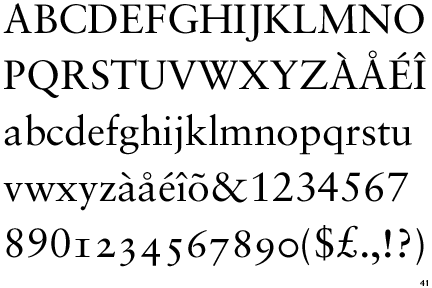
Tschichold simplified typography designs and layouts, creating many different fonts, including Sabon and Transit.

Sabon Typeface

This simplification can be easily seen through Tschichold’s Penguin Book covers. Pre Tschichold, Penguin Books used two different fonts, along with a mix of bold and normal weights. Tschichold simplified the covers down to one font and weight, and focused wholeheartedly on the tracking and kerning of the individual letters, spacing out each one to give a more refined and cared for design.

Tschichold's Cover on Right

Tschichold was a typographic designer creating before his time; he was supremely influential in showcasing how type can be more than simply type. It can be an art form and design in itself. He taught others to take care in the positioning of their type on a page, as well as the simplification of the actual typeface.

Another designer who is innovative in the field of type and type design is Anna Garforth. She creates tactile typefaces in response to the world around her. She creates typefaces using many different mediums, including dough. Garforth’s ‘Edible Poster’ is an experimentation into linking type with new forms of creation, that of edible work. Garforth has also experimented with other forms of creating type. She creates type by growing moss in the form of the letters in her work for Saatchi and Saatchi as well as her own work ‘Grow’. Garforth highlights that type does not simply have to be 2D. As digitalized design becomes more commonplace, designers are branching out and further extending themselves by pushing the boundaries to create bigger and bolder designs that are constantly evolving and innovating.


Edible Poster Type


Grow Type


Saatchi and Saatchi

Both Tschichold and Garforth were innovative before their time, creating a shift within their own design fields. While they created their typefaces in very different ways, and very different forms, they were similar in that they were leaders in the typographic design field. They were also similar through their handling of type as an art form and not just simply a way to convey information; type is used to convey meaning as well.


Resources-

Jan Tschichold- www.historygraphicdesign.com- information
                       - retinart.net- information
                       - www.olivertomas.com- Penguin Book picture
                       - identifont.com- Sabon Typeface
                       - heathershawdesign.com- Page Layout

Anna Garforth- www.annagarforth.co.uk- all pictures and information