Paul
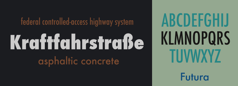
Renner is a German type designer; he created Futura between 1924 and 1926.
Renner shared many of its views, believing that a modern typeface should express
models rather than be a revival of previous design. Futura was commercially
released in 1927, commissioned by the Bauer type foundry.
Renner
avoided creating any non-essential elements, making use of basic geometric
proportions with no serifs or frills, while designing Futura. This font is
crisp, clean froms reflect the appearance of efficiency and forwardness even
today.
His
initial design experimented with several geometrically constructed character
alternatives and old-style figures, which can be found in the typeface AEG
Renner. AEG Renner is a two weight custom version of the headline typeface
Architype Renner. Paul Renner’s experimental characters are included as
alternatives in the orginal Architype Collections. Named AEG Renner for the
client to aid specification, both regular and bold weights include the distinctive,
alternative lowercase m and n in the main Keystroke positions.
What
lead Futura success? Futura spawned a range of new geometric sans-serif
typefaces, such as Kabel and Century Gothic, among others. Now over 80 years
since its creation, many foundries have released variations of Futura in the
digital form, Adobe being the one of the most commonly used.
Gutura
have become an extremely popular typeface for countless corporate logos, commercial
products, films and advertisements for years. In fact, so popular that certain
art directors had began boycotting its use in with Art Directors Against Futura
Extra Bold Condensed published in 1992’s TDC Typography 13.
Regardless,
Futura remains one of the most used sans-serif fonts today with no signs of
slowing down.
Matthew
Carter is a type designer and the son of the English typographer Harry Carter.
He designed the early 1.0 web fonts Verdana and Georgia for Microsoft, and
these fonts are tuned to be extremely legible even at very small sixe on the
screen. In 1997, he was awarded the TDC
Medal, the award from the Type Directors Club presented to those “who have made
significant contributions to the life, art, and craft of typography. In 2010, he
was named a MacArthur Fellow based on his “exceptional creativity, as
demonstrated through a track record of significant achievement and manifest
promise for important future advances”.
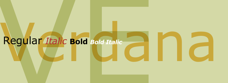
Verdana
was designed by Matthew Carter for Microsoft in the mid-90s, specifically to
improve on-screen readability. The font first shipped with Microsoft Internet
Explorer 3 in 1996. Being one of the ‘Core fonts for the web’— Verdana has
become one of the most widely used fonts on the web. In 2010, it appears
Verdana mat also become one of the most widely used font offline as well.
The
digit 1(one) in Verdana was giver a horizontal base and a hook in the upper
left to distinguish it from lowercase/ (L) and uppercase/ (i).
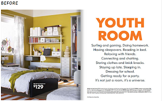
After 50
years of the iconic Futura typeface, IKEA has made a switch to Verdana. In the
2010 IKEA catalog, they changed all typography to the Microsoft font. The font
will replace IKEA Sans (Futura), to Verdana.
According
to Vier5 "you cannot work with modern pictures and at the same time use
the typefaces of the last 50 years. The time for these typefaces is gone.",
“our times require our own letterforms.”
Nowadays,
as the digitalized and distributed in network, some letterforms are extremely
difficult to read on computer. The change in IKEA might just make the online catalog
easier to read, and easier to process. For this reason, they switched to what
it sees as a more functional typeface: Verdana. We’’, that's what the Internet
has made us, right?


No comments:
Post a Comment