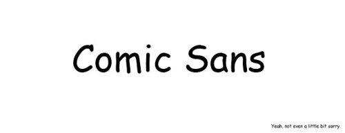
Comic sans is a novelty sans serif script typeface, the modern version of which was designed by Vincent Connare and released as for use in microsoft office in 1994. Connare initially designed the typeface to fill a gap in what microsoft offered as casual font options after seeing Times New Roman being used in speech bubbles of a program being developed to assist new computer users, the typeface was then included in a number of microsoft products and the rest, as they like to say, is history.
Connare drew heavily on the various fonts used in actual comic books (most notably, The Watchmen, lettered by Dave Gibbons and The Dark Night Returns, lettered by John Costanza) at the time to get a similarly informal typeface. This was achieved by him manually drawing each glyph straight into his computer using his mouse, a method that arguably worked against him in creating a fluid and stylistically cohesive font.
One thing particularly lacking, given the typeface’s name, is the ability to effectively use the font in the uppercase which is often the style choice used in comics. It becomes incredibly obvious that the typeface has unresolved kerning issues when it is used entirely in this way (note the space between the T and the A in tangled).

The visual weight of the typeface when used as a body text can also be jarring to read. This is in part due to previously mentioned poor kerning, a fault in the typeface that originates in the lack of letter fit between the characters. In creating a typeface which the characters do not proportionately fit together, proper kerning becomes at best difficult. On top of which, Comic Sans uses unmodulated strokes which can translate as clunky and unrefined when mismanaged. The most blatant example of this is in the lower case ‘e’, in which there is a small eye and large aperture, thanks mostly to the slanted hand drawn effect of the entire typeface. When coupled with the unmodulated strokes it creates a large amount of blac for a small amount of space, throwing off the visual weight of the font.

Though Comic Sans is hardly a ‘designers’ font there are many compelling arguments for and against its readability. Interestingly, it is often viewed as incredibly readable to those with learning difficulties such as dyslexia. The British Dyslexia association lists Comic Sans as a suggested font for children with such difficulties due to the easily distinguishable characters. On top of which, when the typeface is aliased correctly it can be used successfully at much smaller sizes on screen than a lot of it’s designed-for-print competitors.
Comic sans has literally been used for just about every application a font can be used for, which is part of the public’s general disdain for the typeface. However, it is important to note that the designer himself says
“Comic Sans was NOT designed as a typeface but as a solution to a problem with the often overlooked part of a computer program's interface, the typeface used to communicate the message.”.
He reiterates that Comic Sans was intended to be used for children and as an informal, friendly script font it achieves this goal and has been used appropriately for such things as birthday invites, children's books, games and mores specifically was the type used for EA game ‘The Sims’ (and all it’s expansion packs).

Reference List:
This is kind of fascinating - I've never even thought about the person behind Comic Sans..
ReplyDelete