Futura is a geometric sans serif typeface influenced by the
Bauhaus design style of 1919 - 1933. It was developed by Paul Renner from 1924
to 1926 before he commercially released the final design of the typeface the
following year. It is based on geometric shapes, each letter is derived from
simple geometric shapes including near perfect circles, triangles and squares
which helps it achieve its consistency from character to character. Its strokes
are of near-even weight which differ marginally, this is most evident in the
stroke of the letter 'o' which is an almost perfectly round stroke. The
lowercase letters in Futura have really tall ascenders in contrast to many
other typefaces where they actually rise above the cap line. When designing
Futura, Renner kept things as simple as possible by rejecting any decorative
and non essential elements to be added to the characters. The uppercase
characters have proportions comparable to classical Roman capitals. It is a
typeface that relies on both classical and contemporary type conventions. Its
appearance has been described as efficient, forward, clean and elegant.
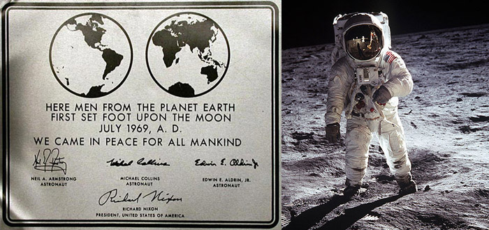
Considering that Futura was designed so long ago, it has had an enduring life span and has been used widely and consistently through its history. In the 1950s it was commonly used by the publishing industry as a general purpose font. Today it is still an important typeface family and is seen being used for print and digital purposes as both a headline and body font. An interesting fact is that the Futura typeface even made it out of the Earth's atmosphere to the Moon as Nasa decided to use it for the plaque left by Apollo 11 astronauts during their visit to the Moon over 40 years ago. It is also known as Stanley Kubrick's favourite typeface, one which he used in the title sequences and posters of 'Eyes Wide Shut' (1999) and '2001: A Space Odyssey' (1968). Futura is also the typeface responsible for many well known logos such as Domino's Pizza, Absolut Vodka and HP for example. Ikea also used it in their catalogues but discontinued in 2010. Well known artist Barbara Kruger also used the typeface in many of her artworks, for example in her piece 'I shop therefore I am' (1987). Closer to home and a very recent use of the typeface Futura, the Western Sydney Wanderers Football Club formed in 2012 have used it in their logo and club documentation. Despite all these examples of popularity the typeface was not always very popular, in 1933 Futura was banned in Hanover by the Lord Mayor who said it did not conform to Germanic Style.
Considering that Futura was designed so long ago, it has had an enduring life span and has been used widely and consistently through its history. In the 1950s it was commonly used by the publishing industry as a general purpose font. Today it is still an important typeface family and is seen being used for print and digital purposes as both a headline and body font. An interesting fact is that the Futura typeface even made it out of the Earth's atmosphere to the Moon as Nasa decided to use it for the plaque left by Apollo 11 astronauts during their visit to the Moon over 40 years ago. It is also known as Stanley Kubrick's favourite typeface, one which he used in the title sequences and posters of 'Eyes Wide Shut' (1999) and '2001: A Space Odyssey' (1968). Futura is also the typeface responsible for many well known logos such as Domino's Pizza, Absolut Vodka and HP for example. Ikea also used it in their catalogues but discontinued in 2010. Well known artist Barbara Kruger also used the typeface in many of her artworks, for example in her piece 'I shop therefore I am' (1987). Closer to home and a very recent use of the typeface Futura, the Western Sydney Wanderers Football Club formed in 2012 have used it in their logo and club documentation. Despite all these examples of popularity the typeface was not always very popular, in 1933 Futura was banned in Hanover by the Lord Mayor who said it did not conform to Germanic Style.
Futura was not the first geometric sans serif typeface, but it was the most
successful and has gone on to inspire many other typefaces such as Kabel,
Metro, Vogue, Spartan, Twentieth Century, and Century
Gothic among others, which have used Futura for their
foundations.
Vinko Kraljevic
"Behaviour.apply('webfont_button');." Futura® ND. 12 Mar. 2013 <http://www.myfonts.com/fonts/neufville/futura-nd/>.
"Futura – Past, Present and
Futura(e)." Nadinechicken. 12 Mar. 2013
<http://nadinechicken.wordpress.com/2011/12/27/futura-past-present-and-futurae/>.
"Futura | Typophile." Futura | Typophile. 12 Mar.
2013 <http://typophile.com/node/12494>.
Ronson, Jon. "Citizen Kubrick." The Guardian. 26
Mar. 2004. Guardian News and Media. 12 Mar. 2013
<http://www.guardian.co.uk/film/2004/mar/27/features.weekend>.
http://www.guardian.co.uk/artanddesign/gallery/2009/sep/02/ikea-font-futura?picture=352473558&morepage
http://www.guardian.co.uk/artanddesign/gallery/2009/sep/02/ikea-font-futura?picture=352473558&morepage
http://nadinechicken.files.wordpress.com/2011/12/futura.png
http://idsgn.org/images/know-your-type-futura/Apollo11Plaque.jpg
https://blogger.googleusercontent.com/img/b/R29vZ2xl/AVvXsEgLwgHF9_0ftCkEeDj_7_4AQSG5Uqc60gBidNazxKcbeAF6VUodP3FExsHpYBs99rbiTPeOKpviM17JtOTL-qKB-nhLHpQk6-KjO9o1MWqmT25vIaV76Y0zFnlb3lGw5TKeAR67XriUt64/s400/kubrick-opening-title-2001-space-odyssey.jpeg


No comments:
Post a Comment