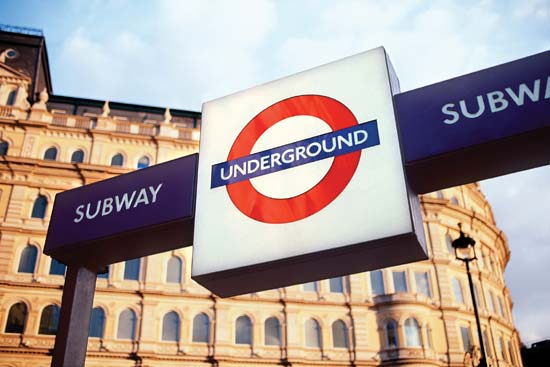
Johnston
Exactly 150 years ago the intricate and
iconic British underground system was established which was accompanied by the
birth of an almost equally iconic typeface known as ‘Johnston’.
 |
| Bull, J. A Typeface for the Underground |
Commissioned in 1913, the British calligrapher and lettering artist Edward Johnston,
was asked to create a typeface with "bold simplicity" that was truly
modern yet rooted in tradition (Clark, L). The elegant and bold
solution was completed in 1916, and was deemed a combination of classical Roman
proportions with Humanist warmth- qualities that are known to be the source of
inspiration for Eric Gill, when designing the infamous Gill Sans typeface
family (Lucas, G).
 |
| Bull, J. |
Johnston himself only drew one weight
when designing the typeface. He based its weight and proportions on seven
diamond-shaped strokes of a pen stacked in a row (Clark, L.). This was subtly
imposed in the typeface itself, with the diamond used as the tittle of the
"i" and "j".
 |
| Lucas, G. |
As it was becoming less and less
practical to use the old wood and metal type, the typeface was revised upon the
commission of the design agency banks and miles in 1979, to prepare for the
typesetting systems of the day. The result was a reinterpretation of the
proportions as well as the creation of a family with two new weights and
italics known as ‘New Johnston’ and still used by the transport system as
official branding to this day.
 |
| Clark, |
What makes the analysis of this
typeface so interesting was its birth as a fully commissioned project with a
seemingly singular purpose. The job was requested by the commercial manager of
the Underground Group to fortify the company’s corporate identity and as such,
had various parameters and objectives that normal typeface design did not
necessarily have to comply with. One of the main objectives was that the use of
the typeface was to prevent the official railway signage from being mistaken as
general advertising (Ashworth, M). This meant that the typeface had
the purpose of balancing it’s role as a corporate identity tool, yet make a
statement about the modernist vision London held of itself at the time, while
carrying "the bold simplicity of the authentic lettering of the finest
periods".
In many ways the typeface achieved
this. It’s heavy stroke weight and wide, symmetrical counters meant that the
typeface was crisp and rounded from a distance. True to the humanist style, it
was distinctly rounder than many other typefaces of the gothic style (Bull,
J). This recall to roman ideals was an indication of the modernist
direction that London began to identify with. It is consistently proportioned
with straight stems had a certain sharpness around the angular corners and in
particular, the uppercase which stark combination of a stout overall
appearance, yet individually, incredibly geometric.
The continual use of this typeface for its original purpose indicates its success in relation to its intention. What as asked from Edward Johnston was a typeface to identify the British underground system, yet the longevity of it’s relevance can be attributed to his ideals in drawing from the best qualities of various typeface periods- in true modernist tradition. Its unique and iconic identity is a case of one of the most successful typeface commissions and branding identities of the 21st century.
The continual use of this typeface for its original purpose indicates its success in relation to its intention. What as asked from Edward Johnston was a typeface to identify the British underground system, yet the longevity of it’s relevance can be attributed to his ideals in drawing from the best qualities of various typeface periods- in true modernist tradition. Its unique and iconic identity is a case of one of the most successful typeface commissions and branding identities of the 21st century.
 |
| Ashworth, M |
Reference list:
1.
Clark, L. The iconic London Underground typeface turns
100 , http://www.wired.co.uk/news/archive/2013-01/16/london-underground-typeface
<accessed 10 March 2013>
2.
Burgoyne, P. London 2012: the look of the Games, http://www.creativereview.co.uk/cr-blog/2012/july/london-2012-the-look-of-the-games,
<accessed 10 March 2013>
3. Lucas, G. P22's
Johnston Underground fonts http://www.creativereview.co.uk/cr-blog/2013/march/p22s-johnston-underground-fonts
<accessed 11 March 2013>
4. Ashworth, M. The
history of the Johnston typeface http://www.signdesignsociety.co.uk/index.php?option=com_content&view=article&id=199%3Atransforming-exhibition-road&Itemid=9
<accessed 11 March 2013>
5. Bull, J. A Typeface
for the Underground, http://www.londonreconnections.com/2009/a-typeface-for-the-underground/
<accessed 11 March 2013>


No comments:
Post a Comment