Kabel
Created by Rudolf Koch
for the Klingspor Foundry in 1927, Kabel was one of the early triggers for the
sans serif revolution of the late 1920s (Remington, 2003, 39). German Foundries competed to develop the
early sans serif fonts, producing an array of results influenced by German
modernist ideals and modular principles including “Futura” (Raizman, 2003, 192).
 Kabel, however,
preserves elements of the Roman alphabet, as well as an expressionist
influence. Koch’s fascination with classical type and practises of calligraphy
are illustrated in the balance between traditional forms and modern influence
as a characteristic seen across many of Koch’s typefaces.
Kabel, however,
preserves elements of the Roman alphabet, as well as an expressionist
influence. Koch’s fascination with classical type and practises of calligraphy
are illustrated in the balance between traditional forms and modern influence
as a characteristic seen across many of Koch’s typefaces.
“Kabel”, as a name
reveals much of its purpose- to mirror the technology, progress and invention occurring
at the time, where other decorative typefaces were failing. Its geometric form,
and multi linear composition are said to be an ode to the trans- Atlantic
telephone cable (Alterman et al, 20).
A notable development
in type seen in the sans serif typeface’s developed at this time was the
re-proportioning of letters, rather than following a set of uniform widths
(Remington, 2003, 39). This, and its short x height, is what give Kabel its
sense of uniformity. However, the long ascenders and descenders in the 1927
version of the typeface liken it to Futura, and interrupt the horizontal flow
created by this re-proportioning.
 Kabel has a number of
characteristics that do set it apart from the abundant geometric sans serif
typefaces of the time. Its angular stroke endings see that it does not sit
flush with the bottom of the page, giving it a movement and animation that was
not being experimented with in other instances. Particularly in the upper case,
this movement results in a highly effective headline font.
Kabel has a number of
characteristics that do set it apart from the abundant geometric sans serif
typefaces of the time. Its angular stroke endings see that it does not sit
flush with the bottom of the page, giving it a movement and animation that was
not being experimented with in other instances. Particularly in the upper case,
this movement results in a highly effective headline font.
Koch’s traditional
Roman type influence is seen in his lower case “a” and “g”, which differ from
the geometric construction of his other characters (Alterman et al, 177). The
angled cross bar of the lower case “e” has also been linked to Carolingian script,
a form of calligraphy. It also echoes the angle of the stroke endings
(Consuegra, 2004, 274). Victor Caruso carries this over in the redesign for
ITC.
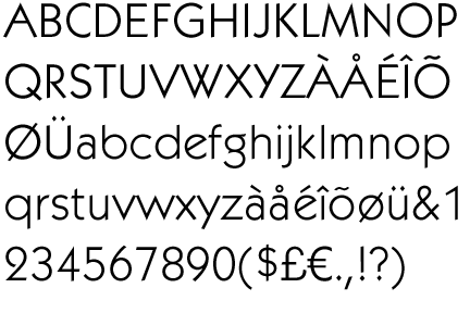 Kabel ITC is
much more widely used than the original. The main updates were a greater
x-height, creating a broad
appearance in both upper and lower case, as well as more consistent stroke
weights. He also added diamond
shaped tittles.
Kabel ITC is
much more widely used than the original. The main updates were a greater
x-height, creating a broad
appearance in both upper and lower case, as well as more consistent stroke
weights. He also added diamond
shaped tittles.Kabel is a link between the early sans serif typefaces, and their contemporaries. Although effective in creating a modern and geometric typeface at the time, Kabel has not been as successful as its peers of Futura and Gill Sans in resonating with contemporary society. Perhaps a result of the typeface’s angled stroke endings and heavy roman influence, the typeface is a sound display font, but has not been able to be translated as a modern sans serif typeface.

Alterman,
T. Tselentis, J. Haley, A. Poulin, R. Seddon, T. Henderson, K. Leondas, G.
Saltz, I. (2012). Typography,
Referenced: A Comprehensive Visual Guide to the Language, History, and Practice
of Typography, USA: Rockport
Consuegra, D. (2004). American Type Design and Designers, USA:
Allworth Press
Raizman, D. (2003), History of Modern Design:
Graphics and Products Since the Industrial Revolution, UK: Laurence King Publishing
Remington, R (2003).
American Modernism: Graphic Design 1920-1960, UK: Laurence King Publishing
Well written, great example and referencing. I am in love with the Y and the W.
ReplyDelete