Wednesday 12 June 2013

Discussion Point 3 - Chere

Discussion Point: The digital desktop shifts the responsibility of preparing artwork for reproduction to the designer. Identify an area of file preparation you need to learn more about and provide an overview (200 word max) of the process and its significance


An area of file preparation I would like to learn more about is colour spaces. It is something we've had direct experience with in the course of this elective. Colour spaces impacts accurate, consistent reproduction,
which fuels my concern. As it is a mix of knowledge and trial-and-error, I feel the best thing to do is to
leave oneself enough buffer time with hardcopies / trying out various printers to accurately ascertain the final look of the printed product. (of course, in conjunction with knowledge of colour profiles, paper, differing software/calibration/lighting conditions, and the many factors that affect how ink on paper looks!) 

Some interesting points I found out while reading up include:

- There are digital printers with more than 4 colours (for example Hexachrome)

- Rich Black / Litho Black is a useful swatch to keep on hand for deep, deep blacks. It is 70%, 40%, 40%, 100% (CMYK order)

- This chart:


Sources

Know Your Onions by Drew de Soto (an excellent read!)

Discussion Point 2 - Chere

Discussion Point 2 : Select two innovative typographic designers - one pre-digital (1984), the other contemporary. Provide a brief comparative analysis of their contributions to typographic practice supported by relevant examples of their work


Sarah Wyman Whitman vs Barbara deWilde


(Noticing how all the featured designers mentioned in the online lecture were male, I eventually found the book Women in Graphic Design and came upon these two designers.)


Sarah Wyman Whitman (1842-1904) pioneered the role of artist-designer in the book industry and in the process revolutionized trade bookbinding. A highly-regarded Boston artist and socialite who gathered around herself a salon comprised of many of the city and region’s best-known writers, she adopted the role of mediator between her author friends and the publisher George Mifflin, whom she knew socially. Her work echoed the Arts and Crafts Movement that viewed art and life as inseparable; she wrote that “all forms of labor are beautiful and sacred because…it all has the stamp of nobility, being essential to the world’s need.” As Betty Smith has noted, Whitman became “the first professional woman artist regularly employed by a Boston publisher to give their mass-produced book covers a sense of simple elegance through line, color, and lettering.” (Boston Public Library)


Possibly in reaction to the rather overwrought covers that were the norm in the 1870s and 1880s, Whitman reduced book decoration to the essential. Although she designed "special" editions in vellum with gold stamping, the majority of her work for the mass market employed two colors of cloth and a single color of ink for stamping. The production costs for Whitman's book covers were probably quite low when weighed against their effectiveness as advertising tools. (Library of Rochester)

Sarah Whitman covers from the gorgeous flickr set (Boston Public Library)


It would be hard to overstate the impact of Barbara deWilde on contemporary book cover design. Alongside Carol Devine Carson, Chip Kidd and Archie Ferguson, Barbara’s designs not only defined the bold, visual aesthetic now commonly associated with Knopf, but helped reinvent American book cover design in the 1990′s.


Barbara left book publishing in 2000 to become the design director of Martha Stewart Living – where she successfully implemented a redesign of the magazine, but returned to Knopf  seven years later and created more characteristically distinctive book cover designs, including the jacket for the Pulitzer Prize winning novel A Visit From the Goon Squad by Jennifer Egan. (The Casual Optimist, 2012)


Source: Women in Graphic Design (Breuer & Meer, 2012)


Further book jacket design from deWilde

Comparision:
Both designers display masterful use of negative space that helps provoke a sense of  'specialness'; it imbues the book with an aura of something a little extraordinary. It makes the viewer curious and compels one to pick up the book. This sense of elevation would probably not be as effective if not for the existing sea of unremarkable book covers, in both their respective time frames. Both also display considered materiality; in Whitman's case cloth was carefully selected, as with colour, and in her letters she displayed a keen consideration for the story contained within the pages. In deWilde's book jacket work, especially in the 90s, what set her work apart were plastic yet plush jacket materials; a trend that remains popular in bookstores today. All in all looking at the work of these designers has been thought provoking.


------------------------

Sources
 
Breuer, G., & Meer, J. (2012). Women in graphic design 1890-2012. Jovis Verlag Gmbh.

http://2000pounds.com/2012/12/14/a-history-of-publishers-bindings-part-four-women-designers-and-conclusion/

Sunday 9 June 2013

Discussion Point:3

The digital desktop shifts the responsibility of preparing artwork for reproduction to the designer. Identify an area of file preparation you need to learn more about and provide and overview (200 word max) of the process and its significance.

When I’m thinking about the area of file preparation that I need to learn more about it must be the colour management. As we know, we can create lots of colour in RBG mode, but some of them are not achievable if we using a standard four-color process printing. Therefore, we should start our document in CMYK colour mode to make sure that we have a better idea of how ours colour are going to print.
Also, we need to use Grayscale for Black and White artwork or images. We use extraordinary grayscale printing profiles that will only use the black, light black, and light light black inks to produce superior gray tones, without any color shift.

There are 2 types of black we can use when we doing printing—Rich black, and black. If we want an area of solid black in a document, we should us rich black, because it can make be mixing other colour of ink with black ink to produce a darker and deeper black.

Referencing:
Panacchia, C. (2010), A Guide to preparing Files for Print, from <http://designinstruct.com/print-design/a-guide-to-preparing-files-for-print/>, Design Instruct. [Access on 10th Jun 2013]

Discussion Point: Cultural and contextual consideration for online text


Paul Renner is a German type designer; he created Futura between 1924 and 1926. Renner shared many of its views, believing that a modern typeface should express models rather than be a revival of previous design. Futura was commercially released in 1927, commissioned by the Bauer type foundry.

Renner avoided creating any non-essential elements, making use of basic geometric proportions with no serifs or frills, while designing Futura. This font is crisp, clean froms reflect the appearance of efficiency and forwardness even today.

His initial design experimented with several geometrically constructed character alternatives and old-style figures, which can be found in the typeface AEG Renner. AEG Renner is a two weight custom version of the headline typeface Architype Renner. Paul Renner’s experimental characters are included as alternatives in the orginal Architype Collections. Named AEG Renner for the client to aid specification, both regular and bold weights include the distinctive, alternative lowercase m and n in the main Keystroke positions.  

What lead Futura success? Futura spawned a range of new geometric sans-serif typefaces, such as Kabel and Century Gothic, among others. Now over 80 years since its creation, many foundries have released variations of Futura in the digital form, Adobe being the one of the most commonly used.

Gutura have become an extremely popular typeface for countless corporate logos, commercial products, films and advertisements for years. In fact, so popular that certain art directors had began boycotting its use in with Art Directors Against Futura Extra Bold Condensed published in 1992’s TDC Typography 13.

Regardless, Futura remains one of the most used sans-serif fonts today with no signs of slowing down.


Matthew Carter is a type designer and the son of the English typographer Harry Carter. He designed the early 1.0 web fonts Verdana and Georgia for Microsoft, and these fonts are tuned to be extremely legible even at very small sixe on the screen.  In 1997, he was awarded the TDC Medal, the award from the Type Directors Club presented to those “who have made significant contributions to the life, art, and craft of typography. In 2010, he was named a MacArthur Fellow based on his “exceptional creativity, as demonstrated through a track record of significant achievement and manifest promise for important future advances”.

Verdana was designed by Matthew Carter for Microsoft in the mid-90s, specifically to improve on-screen readability. The font first shipped with Microsoft Internet Explorer 3 in 1996. Being one of the ‘Core fonts for the web’— Verdana has become one of the most widely used fonts on the web. In 2010, it appears Verdana mat also become one of the most widely used font offline as well.

The digit 1(one) in Verdana was giver a horizontal base and a hook in the upper left to distinguish it from lowercase/ (L) and uppercase/ (i).


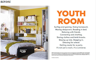
After 50 years of the iconic Futura typeface, IKEA has made a switch to Verdana. In the 2010 IKEA catalog, they changed all typography to the Microsoft font. The font will replace IKEA Sans (Futura), to Verdana.

According to Vier5 "you cannot work with modern pictures and at the same time use the typefaces of the last 50 years. The time for these typefaces is gone.", “our times require our own letterforms.”

Nowadays, as the digitalized and distributed in network, some letterforms are extremely difficult to read on computer. The change in IKEA might just make the online catalog easier to read, and easier to process. For this reason, they switched to what it sees as a more functional typeface: Verdana. We’’, that's what the Internet has made us, right? 


DISCUSSION POINT 3 – CANDY

The digital desktop shifts the responsibility of preparing artwork for reproduction to the designer. Identify an area of file preparation you need to learn more about and provide an overview (200 word max) of the process and its significance.


I think I really need to learn more about the image file formats of file preparation. Before this lecture, I think the best formats for output definitely could be PDF and TIFF. And I always use PDF to print. From my understanding, EPS must be used a specific software to create. A TIFF file is the most widely used file format in desktop publishing today. It is a raster-based file that supports the following: RGB, CMYK, Grayscale, Lab, and Indexed color. TIFF files can be compressed by using loss less compression approach or JPEG lossy compression. For high-end print production, it is the best practice to use a very small amount of JPEG compression. The JPEG compression approach is a lossy compression that will degrade image quality when used in large amounts.


References:

Tuesday 4 June 2013

Discussion Point 3

Identify an area of file preparation you need to learn more about and provide an overview (200 word max) of the process and its significance.

Colour Space:

A "colour space" is a conceptual tool for understanding the colour capabilities of a digital file. When trying to reproduce colour on a device, colour spaces can show whether you will be able to retain shadow/highlight detail, colour saturation, and by how much either will be compromised.

Unlike an artist's palette, colour spaces remain invisible and serve only as behind the scenes calculations, but learning to visualise them can help you to identify the most suitable colour space to use for a project.

Precise Colour Management = the slight differences in colour on screen including ambient light, artificial lighting, monitor calibration and the colour profile of files

IMPORTANT TO NOTE: what you see onscreen is not a true representation of the print colour of your work.

TYPES of Colour Spaces: DEVICE DEPENDENT & WORKING SPACES
There are many different types of colour spaces and applications including:
  • Device-dependent spaces: express relative colour - the subset of colours displayed using a monitor, printer, camera or scanner.
  • Device-independent spaces: express colour in absolute terms - a universal colour reference, useful to compare with other devices. 
  • Working spaces: use image editing programs and file formats to constrain the range of colors to a standard palette - most common  in digital photography are RGB and CMYK.  
Reference:
  • http://www.cambridgeincolour.com/tutorials/color-spaces.htm

Discussion Point 3 - Yuni

Identify an area of file preparation you need to learn more about and provide an overview (200 word max) of the process and its significance.

For the tl;dr crowd: Page order.

It might sound like a very simple thing, but if you're printing a booklet, putting your page in order can be tricky. I'm talking about booklets that use saddle-stich or staple binding, specifically, where you're printing four pages on the same sheet of paper and folding it in half. You don't want to work hard on your layouts and images, but end up with completely wrong page order for your booklet! A booklet is only as good as its page order. One might even say. (Okay, no one says that, but it's true nonetheless!)

Here's a visualisation:


Now most people who are familiar with InDesign know there's a feature for this in the software. You can just go to "File" > "Print Booklet..." 

 
Then under "Setup", choose the pages you want to print, and go to "Preview" to check the pages.


To make sure the pages are correct I normally make a teeny tiny booklet, just out of some scrap papers, write the page numbers on the mini booklet, and match that with the one on screen.

Ideally, after this, you'll press "Print", but what if you're printing it somewhere else, and your printer doesn't accept InDesign files? Fret not, you can click "Print Settings...".


Here, choose "PostScript File" for the "Printer" option, choose your paper size, printer's marks, bleed, etc under the various options, then click "Ok"


Now press "Print", your file will now be saved with a ".ps" extension. This might seem unfamiliar to you, but you can use Adobe Acrobat Pro, or even Preview in Mac computers to open it, and it will give you a PDF file of your booklet, in the booklet order, ready to print!

References:

  • http://help.adobe.com/en_US/indesign/cs/using/WSa285fff53dea4f8617383751001ea8cb3f-704ba.html